
The Primeval Thule Campaign Setting will feature cover art by the illustrious illustrator, Todd Lockwood. You might recall that we had to wait until a window opened in Todd’s schedule. That meant we couldn’t provide a cover sketch during our Kickstarter campaign or show off what the cover poster would even begin to look like. In November Todd was finally able to turn his attention to Thule, so we (well, Rich Baker) drove down to Todd’s house and spent a morning going over everything Thule with Todd.
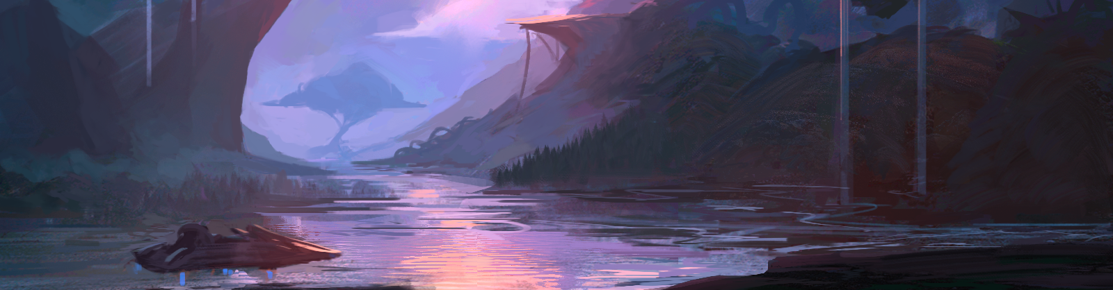
We began by reviewing the 80-ish pieces of interior art we already had in hand just to refresh Todd on the sword-and-sandals vibe we are trying to capture with the world. Then we talked for a good long time about what elements would be most important to capture on the cover image: What says Thule more than anything else? Here are a couple of the big pieces we knew we would want to feature:
-
A prominent barbarian character
-
Glaciers or jungles
-
Mysterious ruins
-
Lovecraftian monster or Ice Age beasts
-
Secondary figures that reflected sword-and-sandal adventure, not medieval fantasy
We went into the discussion with the idea that our cover ought to be something along the lines of “Conan fighting Cthulhu,” but Todd persuaded us that man vs. monster on a cover can be tough to pull off, since one or the other needs have its back to the viewer. He suggested using the alien beings as more of the stage dressing, perhaps by featuring ruins with reliefs or carvings that conveyed disturbing images or by positioning them as just-defeated corpses the heroes can be looking away from. Since we’re not entirely dumb, we listened carefully to what Todd had to say.
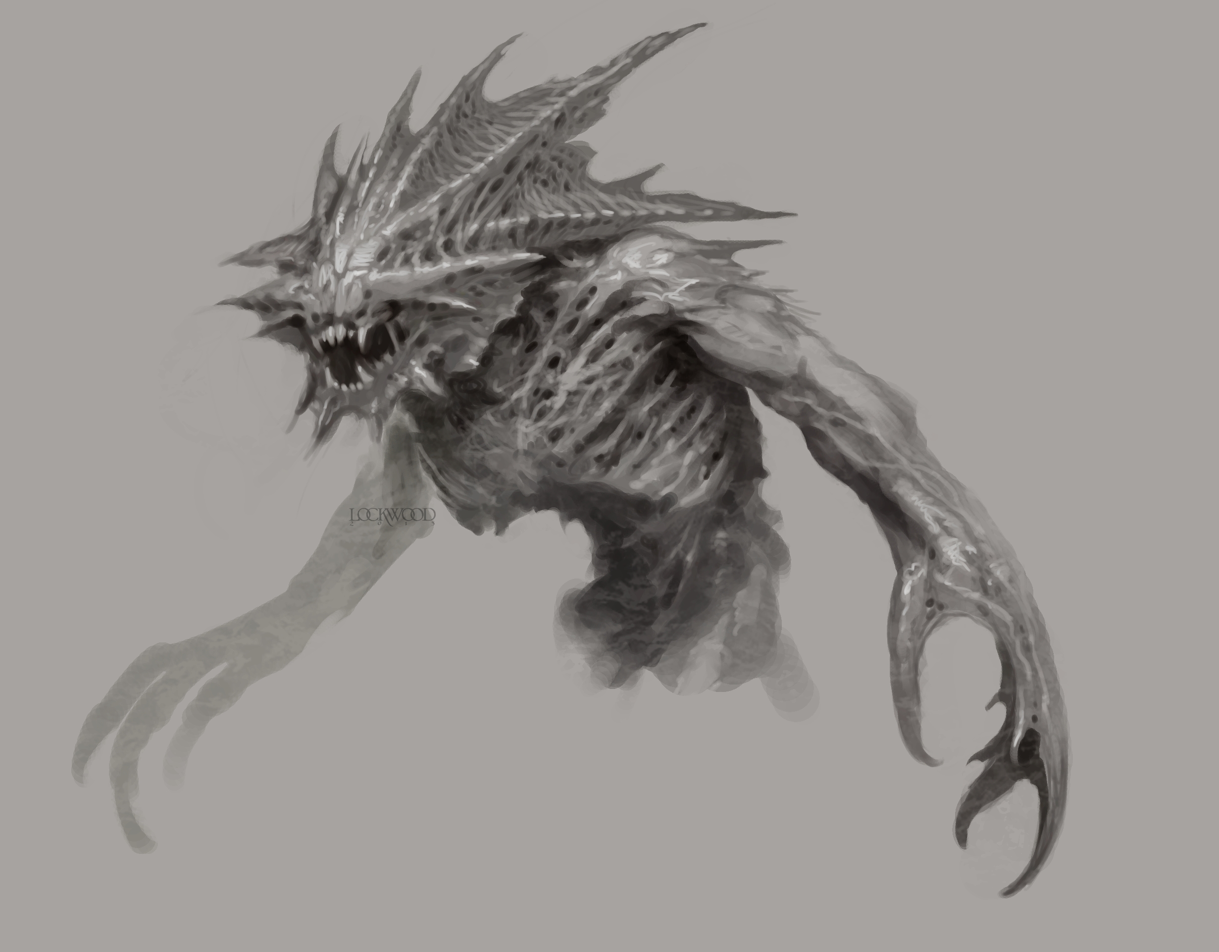 Looking through our monster concepts, Todd and Rich settled on Justin Mayhew’s star-thing of Nheb as a suitably Lovecraftian monster to feature on the cover. Todd played around with the sketch, and here’s what Todd’s version looks like:
Next, we moved on to some very rough compositions. The star-thing monster design mentions cyclopean ruins on snowy mountaintops, so that steered us toward “glacier” over “jungle.” And we wanted to make sure the viewer got a good look at what a hero in this setting looks like. Todd next gave us some rough thumbnails, so we could play around with things like sizes, perspectives, and the basic composition. Here’s what Todd came up with for the first set of rough compositions:
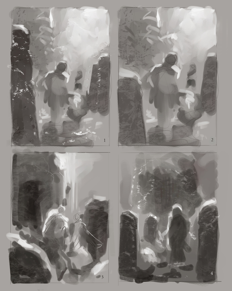 These are a great beginning and would make for excellent cover paintings, but we all agreed that we wanted something that showed a little more in the way of jaw-dropping vistas and dark, mysterious ruins dripping with menace. Todd pulled back the camera a bit to let the scenery play a bigger part in the composition, and also began to work on the value study (what’s dark, what’s light). This really begins to tell the story of what the final painting is going to look like. The big areas of dark stone are likely to be covered with “images within images,” where we can see depictions of star-things doing terrible things in the weathered stone carvings.
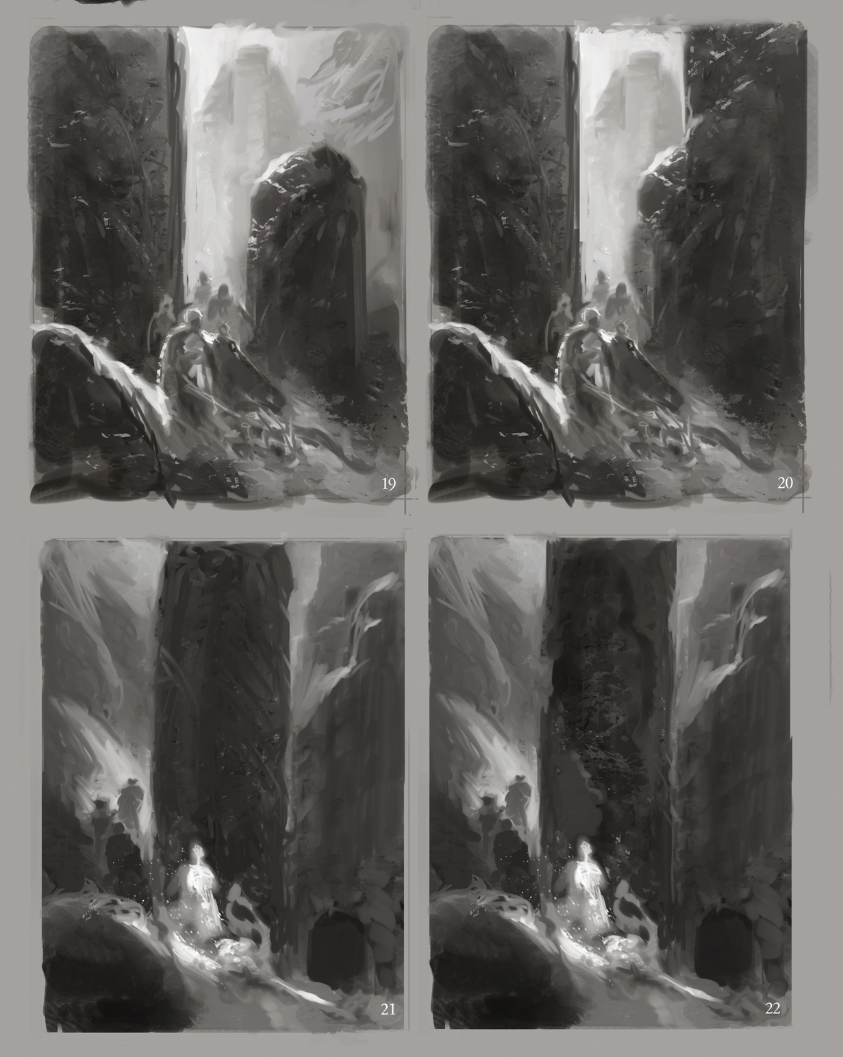
We talked these over at length, and decided that we liked the “gate” pillar shapes better than the “center” pillar shape, especially if we could make sure we caught some tantalizing glimpses of wide-open scenery through the gap. Finally, one of the tricky bits in doing a cover painting is coming up with a composition that won’t fight with the logo or title treatment that will be added after the artist is done. Todd took a closer look at our logo and played around a little bit with what a cover with logo placement might look like:
![]()
As you can see, this is starting to look an awful lot like the cover of a RPG setting book. It’s still a rough, but you should be able to see where Todd is going with the piece. We Sasquatches are certainly very excited!
Naturally, the logo won’t be included on the prints of the cover image that will be produced—that’s a title element for the book. So, if you marked yourself down for a Lockwood print, your poster won’t have a giant Thule logo in the middle. And if you feel like you want to jump in on the poster at this point, just drop us a line at info@sasquatchgamestudio.com, and we’ll get you added to the list.
Thanks for your support! This is really starting to come together!